The Start of Analyzing the Fargo Marathon

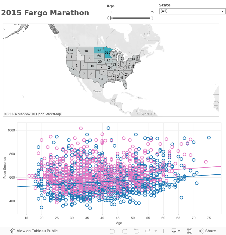
This last weekend, I made it up to Fargo, ND to observe the thousands of runners take to the streets  on Saturday morning to push their bodies to the limits. I was not one of the racers, but my brother from Phoenix, Arizona happened to be one. Looking at the results online, it made me realize that massive amounts of data existed with races that wasn't being used to its fullest potential. Hence, I wanted to start visualizing some race data. I learned that working with race data is significantly more challenging than expected as Visualization tools aren't fit to handle time lengths as a data type, so even comparing something like pace or total time is a challenge. The only solution I've found is to convert everything to total seconds, which isn't much fun either.

Here's the start of the Fargo Marathon data visualization. I'll have a more complete visualization this weekend featuring both Half-Marathon/Marathon Runners. So far, the two graphs displayed are first the location of runners, and second the runners average pace over their age. I've added a trend line to the bottom graph. Keep in mind that runners below the trend line are on average a faster runner than their peers, while above the trend line means runners are slower than their peers at that age group. Click and play around with the visualization as much as you'd like! 

If you have additional ideas for visualizations, shoot me a Tweet on Twitter @JamieVMartin or send me an e-mail at jvmartin07@gmail.com. I'd love to hear your thoughts! Finally - watch for my final visualization and dashboard later this week. 


My First Blog Posting: Visualizing Market Real Estate Data

For my very first blog posting ever, we're going to keep it simple. If you've read the other parts of my website, you'll know that I'm hoping to use this blog to help tell different stories about data. In this post, we start by taking a look at a market we're all familiar with - the Real Estate Market. 

A lot of different factors determine where someone wants to move. The two most basic factors for people are Income and Housing Costs. So to keep things simple for my first visualization, I started with those two things.

I collected data from realtor.com that was able to calculate the metro area averages of the cost of a home, average number of days a home stays on the market, and the number of homes for sale in each metro area. This data is represented in the dashboard. Each dot in the dashboard represents a major metro with the size of the dot referring to the number of homes in that metro area and the color of the dot being noting the cost. So a large blue dot would mean that homes are fairly affordable and readily available, while a small red dot would mean that homes in that metro area are fairly expensive and not as common. The average cost of a home on today's market in the US: $220,000. 

Meanwhile- I've also taken the state by state income date and overlayed that on the map tableau to give you an idea of where the actual best bang for your buck will be. This time the more red a state is, the less money that is made on average there, while the more green a state the more money made in that state. In theory, what you should be looking for is a location that has a green state with a blue dot on the metro area, meaning large incomes and cheap homes. 

Feel free to explore and interact with the map as much as you want. Note that as you use the filters and select data, all areas of the graph do change. Any comments or feedback, feel free to e-mail me at jvmartin07@gmail.com. Enjoy and Happy Browsing!