For my very first blog posting ever, we're going to keep it simple. If you've read the other parts of my website, you'll know that I'm hoping to use this blog to help tell different stories about data. In this post, we start by taking a look at a market we're all familiar with - the Real Estate Market.
A lot of different factors determine where someone wants to move. The two most basic factors for people are Income and Housing Costs. So to keep things simple for my first visualization, I started with those two things.
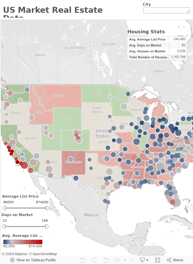
I collected data from realtor.com that was able to calculate the metro area averages of the cost of a home, average number of days a home stays on the market, and the number of homes for sale in each metro area. This data is represented in the dashboard. Each dot in the dashboard represents a major metro with the size of the dot referring to the number of homes in that metro area and the color of the dot being noting the cost. So a large blue dot would mean that homes are fairly affordable and readily available, while a small red dot would mean that homes in that metro area are fairly expensive and not as common. The average cost of a home on today's market in the US: $220,000.
Meanwhile- I've also taken the state by state income date and overlayed that on the map tableau to give you an idea of where the actual best bang for your buck will be. This time the more red a state is, the less money that is made on average there, while the more green a state the more money made in that state. In theory, what you should be looking for is a location that has a green state with a blue dot on the metro area, meaning large incomes and cheap homes.
Feel free to explore and interact with the map as much as you want. Note that as you use the filters and select data, all areas of the graph do change. Any comments or feedback, feel free to e-mail me at jvmartin07@gmail.com. Enjoy and Happy Browsing!